
Alpine
Mountain Trek
Switzerland · 5 days. Guided ascent through alpine passes with mountain-hut stays.
5 days$1,290

The shared UIkit components, each live with its code. The navbar and its hamburger are on /docs/navbar, the inner-page heads on /docs/headers, the bottom sheet (UkSheet) and the filter kit on /docs/sort-filter.
🏆 The skeleton of every site, in almost every demo. On a page, from above:
<UkNavbar>
  └─ 🏆 UkMegaMenuCard     a card in the mega menu panel (on /docs/navbar)
<main>
  <PageHeader>
    └─ 🏆 UkBreadcrumb     the path; the siblings in a dropdown
  a list (services, works)
    └─ 🏆 UkToggleList     grid / list
  FAQ
    └─ 🏆 UkAccordion
<Footer>
└─ 🏆 UkSocialLinksלאיזה תוכןכל עמוד פנימי שיש מעליו לפחות רמה אחת (שירות בתוך שירותים, נכס בתוך נכסים)
השאלההעמוד יושב בתוך היררכיה, והגולש צריך לדעת איפה הוא?
Compact page-path navigation with optional sibling dropdown for section switching.
פירורי לחם הם קומפוננטה, אז הרפלקס הוא לעטוף אותם ב-uk-section כמו כל בלוק אחר. לא עושים את זה. הסקשן מביא איתו ריפוד (40 בטלפון, 100 בדסקטופ), השביל מתרחק מהניווט ומהכותרת, ונראה כמו חלק מאזור אחד בדף.
לפי עקרון הקרבה (Proximity), מה שקרוב נקרא כקבוצה אחת. השביל מתאר את הדף כולו (איפה אני נמצא), בדיוק כמו הניווט, ולכן הוא צמוד לניווט מלמעלה ולראש הדף מלמטה, בשורה משלו. רוב הזמן הוא בכלל לא בתוך סקשן: מתחת לניווט, מתחת לתמונת הדר, או מעל גלריה.
המרווחים סביב השביל (מהניווט או מתמונת הדר, אל ראש הדף ואל הבלוק הראשון) הם מערכת אחת, עם הערך ומי נותן כל אחד, ב-/docs/headers. הכלל המלא: הסקיל vertical-rhythm, כלל 3b (.claude/skills/vertical-rhythm/SKILL.md).
PageHeader ו-UkInsideHeader כבר עושים את זה. ראש דף שנבנה ביד מקבל את שתי המחלקות, אף פעם לא spacer ידני סביב השביל:
<header>
  {/* the trail's own row, no uk-section around it */}
  <div className="uk-container uk-breadcrumb-top">   {/* navbar → trail: 10 / 16 */}
    <UkBreadcrumb items={crumbs} />
    <div className="uk-breadcrumb-after" />          {/* trail → head: 32 / 40 */}
    <h1>{title}</h1>
  </div>
</header>
כשהשביל יושב בין שתי קופסאות (תמונת הדר מעל, גלריה או סקשן מתחת), סופרים את הריפוד של כל קופסה בדרך, לא רק של המחלקה שעורכים: הריפוד של שורת השביל (16) ועוד ה-padding-top של הסקשן הבא נפגשים בשקט. npm run rhythm מסמן את שני הכיוונים: CRUMB (מתחת לשביל) ו-CRUMBTOP (מעליו).
לאיזה תוכןקישורים לרשתות החברתיות של העסק, מתוך הגדרות האתר
השאלהלעסק יש פרופילים ברשתות שצריכים להופיע בפוטר או בדף צור קשר?
Renders social icons from a SocialLinks object. One source of truth: drop a key, the icon disappears. Three icon variants live under /public/social-icons/{variant}/.
linkssiteNameiconSizeshowLabelvariantcolorclassName<UkSocialLinks
links={siteSettings.social}
siteName={siteSettings.siteName}
variant="circle" // 'original' | 'circle' | 'shape-only'
color="white" // optional: recolors via CSS mask
iconSize={36}
/>variant: original (default, full brand colors)




variant: circle


variant: shape-only


color prop: CSS mask<img src="...svg"> is a black-box from CSS, you cannot recolor it from outside. When color is set, we render a <span> with mask-image: url(svg) and background-color. The SVG becomes a stencil, the background is the color.
fill-rule="evenodd" or an SVG <mask> to subtract the inner path.shape-only/. If the SVG ships with a colored rect around the mark, mask renders a filled square. Strip backgrounds before saving.</svg>, no trailing attributes. Some icon-pack exports ship a malformed </svg fill="currentColor"> which breaks SVG-as-mask loading entirely.#uk-toggle-list
לאיזה תוכןעמוד רשימה של 8 ומעלה פריטים, שאפשר להציג כגריד של תמונות או כרשימה של שורות
השאלהיש עמוד רשימה ארוך שיש בו גם מי שסורק תמונות וגם מי שמשווה פרטים?
Sliding-pill segmented control for switching between Grid and List view modes. Controlled component: parent owns value and onChange. A radio group named by label (default "תצוגה"): one tab stop, the arrow keys switch.
valueonChangelabelgridLabellistLabelshowLabelsclassNameconst [view, setView] = useState<ToggleListMode>('grid');
const Card = view === 'grid' ? CardGrid : CardList;
<UkToggleList value={view} onChange={setView} />
<div className={view === 'grid' ? 'grid grid-cols-3 gap-6' : 'flex flex-col gap-6'}>
{items.map(item => <Card key={item.id} item={item} />)}
</div>live demo: toggle to switch layouts
Alpine
Switzerland · 5 days. Guided ascent through alpine passes with mountain-hut stays.

Coastal
Greece · 7 days. Island-hopping itinerary with sea-view villas and local cuisine.

Desert
Morocco · 4 days. Camel caravans, dune camps, and a night under the Sahara stars.

Forest
Norway · 3 days. Off-grid cabin getaway with fjord hikes and sauna evenings.

Urban
Lisbon · 4 days. Walking tours of old quarters, food markets, and rooftop viewpoints.
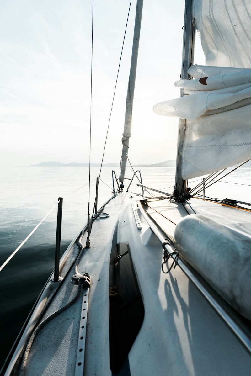
Sailing
Croatia · 6 days. Crewed sailboat along the Dalmatian coast, anchoring at hidden coves.
Same pill, another feel: set --uk-toggle-list-ease and --uk-toggle-list-duration on a scope around it.
showLabels={false}default--uk-toggle-list-ease: var(--ease-spring)ONE data array → ONE pagination state → ONE view state → TWO specialized Card components. Pagination & search work uniformly because the data is single-source. The toggle just picks which renderer to use, NOT which dataset.
Avoid: 2 lists in DOM (duplicates data + needs paired pagination state) or CSS-only layout flip (forces a single Card to handle both layouts, compromised design).
#uk-list-rows
The list view of a collection, from the booking apps (Airbnb experiences): a picture with its own round corners beside the text, no card around the row, the name first and large, one or two small grey lines, a label riding on the picture as a white chip. The picture is a share of the row, never px, so the text always has room.
The list side of a grid / list toggle (UkToggleList), or a list that reads better as rows (the blog's latest posts). Not for a grid of cards (that is the demo's own card), and not for text that must be read whole: the description is cut at two lines and off on a phone.
 הכי פופולרי
ארבע שעות מלאות של ספא: הידרותרפיה, עיסוי החתימה, וסיום של 60 דקות מנוחה עם תה ופירות. החבילה הקלאסית, אם זה הביקור הראשון שלכם אצלנו, התחילו כאן.
 יום מלא
שמונה שעות. כל הטיפולים שאתם רוצים. שתי ארוחות. גישה לכל הסוויטות. בריחה אמיתית מהיומיום, בלי לעזוב את תל אביב.
packages-data.ts). Each row is a whole-card link to its package. On a phone: a square picture, 40% of the row, and no description. Two columns from 960 (uk-list-rows-2@m), where the names step down to 1.25rem.<div className="uk-list-rows"> {/* + uk-list-rows-2@m: two columns from 960 */}
{list.map((p) => (
<article key={p.slug} className="uk-list-row uk-card-link">
<div className="uk-list-row__media">
<img src={p.image} alt={p.imageAlt} loading="lazy" />
<span className="uk-list-row__chip">{p.eyebrow}</span>
</div>
<div className="uk-list-row__body">
<h3><Link href={`${ROOT}/packages/${p.slug}`} className="uk-card-link__target">{p.title}</Link></h3>
<p className="uk-list-row__meta">{p.duration} · {p.persons}</p>
<p className="uk-list-row__meta">{p.price}</p>
<p className="uk-list-row__desc">{p.description}</p>
</div>
</article>
))}
</div>uk-list-rowsthe stackuk-list-rows-2@mwith uk-list-rowsuk-list-row<article>uk-list-row__media<div>img covers it and zooms to 1.04 on hover.uk-list-row__chip<span>uk-list-row__body<div>h2 / h3 is the name: 1.0625rem, 1.5rem from 768, 1.75rem from 1200, two lines at most, underlined while the row is hovered.uk-list-row__meta<p>uk-list-row__desc<p>| Class | On | What |
|---|---|---|
uk-list-rows | the stack | A column of rows, 28px apart, 40px from 768. |
uk-list-rows-2@m | with uk-list-rows | Two columns of rows from 960 (gap 40 / 48). The half-width row steps down: titles 1.25rem, meta 0.875rem. |
uk-list-row | <article> | Picture beside text, centred, no card around it (no surface, border or shadow). Gap 16, 32 from 768, 48 from 1200. |
uk-list-row__media | <div> | The picture: 40% of the row and square on a phone, 34% and 16:10 from 768; its own rounded corners; the img covers it and zooms to 1.04 on hover. |
uk-list-row__chip | <span> | A white label on the picture, at the top end corner. One line, cut with "…" past the picture's width. |
uk-list-row__body | <div> | The text column. Its h2 / h3 is the name: 1.0625rem, 1.5rem from 768, 1.75rem from 1200, two lines at most, underlined while the row is hovered. |
uk-list-row__meta | <p> | A small grey line (0.875rem, 0.9375rem from 768). One line, cut with "…". One or two per row. |
uk-list-row__desc | <p> | Optional. Off on a phone; from 768 two lines at most, 56ch wide. |
uk-list-row uk-card-link, and its name's <a> is the uk-card-link__target: the whole row clicks (uk-card-link, below).text-* on the name or a meta line, no surface or border around the row. The name is an h2 straight under the page's h1 (the spa page), an h3 under a section's h2.*-data.ts; the toggle picks the renderer, never the data.#uk-accordion
לאיזה תוכןשאלות ותשובות, או כל רשימה שבה כל פריט נפתח לפסקה
השאלהיש רשימה שהכותרות מספיקות לסריקה, והתוכן נפתח לפי בחירה?
אקורדיון עצמאי של הפרויקט. אפס תלות חיצונית (לא Radix, לא shadcn). נגישות מובנית: aria-expanded, aria-controls, role=region, ו-keyboard support דרך button טבעי.
typecollapsibleiconפתיחת פריט סוגרת אוטומטית את הפתוח הקודם. collapsible שולט אם אפשר לסגור גם את הפתוח (default: true).
<UkAccordion type="single" collapsible>
  <UkAccordionItem value="q1">
    <UkAccordionTrigger>שאלה</UkAccordionTrigger>
    <UkAccordionContent>תשובה</UkAccordionContent>
  </UkAccordionItem>
</UkAccordion>יוצרים קשר, מקיימים פגישת אפיון של 30 דקות, ומציגים הצעת מחיר מותאמת.
אתר תדמית: 3 שבועות. פלטפורמת SaaS: 6 עד 10 שבועות.
עיצוב, פיתוח, QA, פריסה, ושלושה חודשי תמיכה ראשונים בחינם.
בוודאי, Portfolio זמין באתר. נשמח גם להציג קייסים רלוונטיים בפגישה.
כל פריט מתנהג עצמאית. שימושי לרשימות שצריך לראות בהן כמה תשובות בו-זמנית.
<UkAccordion type="multiple">
  <UkAccordionItem value="q1">
    <UkAccordionTrigger>שאלה 1</UkAccordionTrigger>
    <UkAccordionContent>תשובה 1</UkAccordionContent>
  </UkAccordionItem>
  ...
</UkAccordion>יוצרים קשר, מקיימים פגישת אפיון של 30 דקות, ומציגים הצעת מחיר מותאמת.
אתר תדמית: 3 שבועות. פלטפורמת SaaS: 6 עד 10 שבועות.
עיצוב, פיתוח, QA, פריסה, ושלושה חודשי תמיכה ראשונים בחינם.
בוודאי, Portfolio זמין באתר. נשמח גם להציג קייסים רלוונטיים בפגישה.
הדוגמה הזו משתמשת ב-icon="plus-minus" במקום ה-chevron הדיפולטיבי.
סיכום ה-props:
type="single": רק אחד פתוח (default)type="multiple": כמה פתוחים יחדcollapsible: boolean, רק עם single. true (default) מאפשר לסגור את הפתוחicon="chevron": חץ מסתובב (default)icon="plus-minus": מתחלף בין + ו-−icon="none": בלי אייקוןheadingLevel={3}: מספר ה-heading שעוטף את הטריגר (2-6). default: 3♿ נגישות מובנית, תואם W3C ARIA Authoring Practices
<h3> (ניתן לשינוי דרך headingLevel)aria-expanded + aria-controls על הטריגרrole="region" + aria-labelledby (יקבל שם נגיש מהטריגר)#uk-card-link
כל הכרטיס לחיץ ומוביל לעמוד אחד: uk-card-link על הכרטיס, uk-card-link__target על הקישור של הכותרת. כפתור נוסף בתוך הכרטיס שמוביל למקום אחר מקבל uk-card-link__raise, ונשאר לחיץ בפני עצמו.

::after (click anywhere in it: the project opens) and blue is the uk-card-link__raise link, which keeps its own click (the contact page).<article className="my-card uk-card-link">
<div className="my-card__media">
<img src={p.image} alt={p.imageAlt} loading="lazy" /> {/* not a second link */}
</div>
<div className="my-card__body">
<h3><Link href={`${ROOT}/projects/${p.slug}`} className="uk-card-link__target">{p.title}</Link></h3>
<p>{p.location} · {p.year} · {p.capacity}</p>
<Link href={`${ROOT}/contact`} className="uk-card-link__raise">לבדיקת התכנות</Link>
</div>
</article>#uk-live-frame
לאיזה תוכןאתר או עמוד חי שמציגים בתוך העמוד, עם מעבר בין מחשב, טאבלט וטלפון (עבודות, דמואים)
השאלהרוצים להראות אתר אמיתי שאפשר לגלול בו, ולא רק צילום מסך?
A live page shown inside the site: a bar with desktop / tablet / phone, the page's name and "open in a new tab", and the page in an iframe. Inline, the poster (the screenshot) is the first paint and the demo fades in under it once it has loaded and played its entrance, so the picture never goes white. Page mode is the frame as the whole screen: it arrives like a popup, with no navbar or footer, and its X goes back to the page the visitor came from (a client-side navigation records it), or to backHref on a direct visit.
srctitleposterpagebackHreffullHrefswapframeQuery--uk-live-frame-height<UkLiveFrame src="/demos/x" title="…" poster="…" fullHref="/works/x/preview" /> // inline (/works/x)
<UkLiveFrame page src="/demos/x" title="…" backHref="/works/x" /> // page mode (/works/x/preview)
// the cards that open it
<WorksGrid works={…} transition="expand" /> // /works: "פרטים" grows the picture into the showcase page's frame| opens | the card | "פרטים" | keyboard | where |
|---|---|---|---|---|
| preview | the live demo, full-screen | yes, the showcase page | "פרטים" only (the card link: tabIndex -1, aria-hidden) | /works, the field pages (WorksGrid default) |
| details | the showcase page | no | the card | the demos slider (WorksSlider default), "עוד דמואים" on a showcase page |
| preview-only | the live demo, full-screen | no | the card | landing pages: nothing behind the page, the visitor stays |
A list where the visitor chooses opens the demo and offers the page; a list ON a showcase page, or a teaser slider, leads to a page like the one they are on; a landing page never sends them away.
Live: /works/beautician (inline) and /works/beautician/preview (page mode).
#uk-check-list
לאיזה תוכןשלוש עד חמש שורות קצרות מתחת לפסקה, שקל יותר לסרוק מעוד פסקה
השאלהיש בטקסט כמה נקודות נפרדות שאפשר לכתוב כשורה קצרה לכל אחת?
UkCheck is the V alone, the one drawing of it on the site: use it wherever a line says "included". Tokens: --uk-check-size, --uk-check-color, --uk-check-list-gap.
#uk-scroll-to-main-arrow
לאיזה תוכןhero בגובה מסך מלא, שלא רואים מתחתיו שהעמוד ממשיך
השאלהה-hero ממלא את המסך, וגולש עלול לחשוב שאין יותר?
scroll_to_main_arrow: three chevrons that fall in turn at the foot of a full-height hero, a hint that the page goes on. A click scrolls past the hero it sits in (or to target), under the sticky navbar and through Lenis, with the same landing as any in-page link. The colour is the hero's text colour; it fades out once the page is scrolled and stands still under reduced motion. The hero needs position: relative.
targetlabelclassName--uk-scroll-arrow-size--uk-scroll-arrow-stroke<section className="relative min-h-svh …">
…
<UkScrollToMainArrow /> // past this hero
<UkScrollToMainArrow target="menu" /> // or to #menu
</section>live demo: click the arrow, it scrolls to the end of this box
A full-height hero
#uk-spec-list
A compact list of label and value pairs, as a <dl>, every value starting on the same line.
import UkSpecList from '@/components/uikit/UkSpecList'

<h2>פרטים נוספים</h2>
<div className="uk-spacer-v-12" />
<UkSpecList cols={2} items={[
  { label: 'פתיחה', value: '3 בנובמבר' },
  { label: 'משך', value: 'שישה שבועות' },
  { label: 'מקום', value: 'אולם 2, קומה ראשונה' },
]} />

<UkSpecList lines items={…} />   // a hairline under every row

/* a narrower label column in one block */
.my-specs { --uk-spec-list-label-w: 8rem; }itemsUkSpecListItem[]required{ label, value, id? }, a <dt> and a <dd> in a <div> (a <dl> allows it). id: the React key when the label is not a string.cols1 | 2default 1linesbooleandefault falseclassNamestring<dl>: a hook for a block's tokens.| Prop | Type | Default | What |
|---|---|---|---|
items | UkSpecListItem[] | required | Each { label, value, id? }, a <dt> and a <dd> in a <div> (a <dl> allows it). id: the React key when the label is not a string. |
cols | 1 | 2 | 1 | 2: two columns of pairs from 640px, read row by row. One column under 640. |
lines | boolean | false | A hairline under every row, and a little more air in the row. |
className | string | - | More classes on the <dl>: a hook for a block's tokens. |
#uk-copy-box
לאיזה תוכןטקסט שהקורא צריך לקחת ולהדביק במקום אחר (פרומפט, קוד, כתובת)
השאלההקורא צריך להעתיק את הטקסט הזה?
A text to take away and a button that copies it, then says "הועתק" for two seconds (a live region tells a screen reader). The guide uses it for a request the reader pastes into ChatGPT or Claude (the analytics lesson); a coupon code or an address works the same.
textlabelcopyLabelcopiedLabelscrollclassName--uk-copy-box-max-h--uk-copy-box-accent--uk-copy-box-bg--uk-copy-box-border--uk-copy-box-radius<UkCopyBox label="להעתקה" text="מדריך התקנה מקוצר ל-Google Analytics באתר בפלטפורמה (יש להחליף בשם הפלטפורמה)" />#uk-loader
לאיזה תוכןמשהו שנטען לאט בתוך העמוד (מפה, iframe, וידאו, טופס חיצוני)
השאלהיש בעמוד חלק שמופיע ריק לכמה שניות עד שהוא נטען?
A layer over something that is still loading (an iframe, a map embed, a video, a form on its way), a spinner on it, and a fade once it is ready. done fades it out and keeps it in the DOM, so a second load brings it back. The parent is the positioning box (position: relative). When it is done is the caller's call: UkLiveFrame (the demos on /works) lifts it once the demo has loaded and marked <html data-uk-ready> (uk_global_init, after the page's animations are bound). The load alone came too early: the entrance elements were still hidden, a blank hero.
donelook: cover | veillabelclassName--uk-loader-bg--uk-loader-veil--uk-loader-size--uk-loader-color--uk-loader-fade--uk-loader-z<div className="relative">
<iframe src="…" onLoad={() => setReady(true)} />
<UkLoader done={ready} /> // the page ground + spinner
</div>
<UkLoader look="veil" done={ready} /> // over a poster: veil + spinner in a chip
look="cover" nothing to show until it is ready (the demo popup)look="veil" a picture stands in until then (the live frame over its poster)#uk-clip
לאיזה תוכןסרטון קצר שהוקלט מאתר, כדי להראות אפקט בלי שיפעל בדף עצמו
השאלהיש בדף אפקט שכדאי להראות בסרטון, כי חי בדף הוא ייראה כמו תוכן שמנסים ללחוץ עליו?
A recorded clip as a small player: it plays while on screen and stops off it, with pause, from the start and a progress bar to drag. src is the path without the extension: x.mp4, x.webm and the poster x.jpg. Used on /inspiration and /beta/home. speed is the pace, the video's playbackRate: speed=0.85 calms a clip with no new recording (the left one here). Token: --uk-clip-ratio.
All the clips, and how to record one: Clips.
#uk-icon-list
A short list of outline icons with a few words each: grid for what is included, tiles for key facts.
import { Car, Snowflake, Tv, Wifi } from 'lucide-react'
import UkIconList from '@/components/uikit/UkIconList'

// grid: every item, the missing ones off (greyed out, "אין" read before them)
<h2>מה יש בדירה</h2>
<div className="uk-spacer-v-16" />
<UkIconList cols={2} colsMd={4} items={[
  { icon: <Wifi />, label: 'אינטרנט אלחוטי' },
  { icon: <Snowflake />, label: 'מיזוג' },
  { icon: <Tv />, label: 'טלוויזיה', off: true },
  { icon: <Car />, label: 'חניה', off: !apt.parking },
]} />

// tiles: one card, the icon above the value, the label under it
<UkIconList look="tiles" aria-label="פרטי הקורס" items={[
  { icon: <CalendarDays />, value: '6', label: 'מפגשים' },
  { icon: <Clock />, value: '90', label: 'דקות' },
  { icon: <Users />, value: '12', label: 'משתתפים' },
]} />

// tiles with one line each, a hairline between them
<UkIconList look="tiles" divided items={[{ icon: <Users />, label: '4 אורחים' }, …]} />

/* a block's look, on its own class */
.my-facts { --uk-icon-list-tile-surface: #fff; --uk-icon-list-icon-color: var(--muted-foreground); }itemsUkIconListItem[]required{ icon, label, value?, off?, id? }. icon is an element (<Snowflake />), shown aria-hidden at the list's size and stroke. label is the item's name. value: on a tile, the main line above the label; in the grid, after the label. off: missing, greyed out and announced. id: the React key when the label is not a string.look'grid' | 'tiles'default 'grid'grid: the icon beside its label, in columns (a list of what is included). tiles: one bordered card, equal columns, the icon above the value and the label under it (key facts).colsnumberdefault 2grid: the columns under 768px. Sets --uk-icon-list-cols on the list.colsMdnumberdefault colsgrid: the columns from 768px. Sets --uk-icon-list-cols-md.offLabelstringdefault 'אין'off item's label ("אין מעלית"), so a screen reader never reads a missing item as present.dividedbooleandefault falsetiles: a hairline between the tiles, inset from the card's top and bottom.aria-labelstringaria-labelledby with the heading's id.classNamestring<ul>: a hook for a block's tokens.| Prop | Type | Default | What |
|---|---|---|---|
items | UkIconListItem[] | required | Each { icon, label, value?, off?, id? }. icon is an element (<Snowflake />), shown aria-hidden at the list's size and stroke. label is the item's name. value: on a tile, the main line above the label; in the grid, after the label. off: missing, greyed out and announced. id: the React key when the label is not a string. |
look | 'grid' | 'tiles' | 'grid' | grid: the icon beside its label, in columns (a list of what is included). tiles: one bordered card, equal columns, the icon above the value and the label under it (key facts). |
cols | number | 2 | grid: the columns under 768px. Sets --uk-icon-list-cols on the list. |
colsMd | number | cols | grid: the columns from 768px. Sets --uk-icon-list-cols-md. |
offLabel | string | 'אין' | Visually hidden, read before an off item's label ("אין מעלית"), so a screen reader never reads a missing item as present. |
divided | boolean | false | tiles: a hairline between the tiles, inset from the card's top and bottom. |
aria-label | string | - | A name for the list when no heading above it names it. Or aria-labelledby with the heading's id. |
className | string | - | More classes on the <ul>: a hook for a block's tokens. |
#uk-read-more
לאיזה תוכןטקסט ארוך שרוב הקוראים לא צריכים במלואו (ביוגרפיה, תיאור מפורט, תנאים)
השאלההטקסט ארוך, ומספיקות כמה השורות הראשונות כדי להבין?
A text clamped to N lines with "קרא עוד" under it (a chevron that turns); open shows it all, "פחות" closes it. The height animates between the two. The toggle appears only when the text is really longer than its lines. Children, not a string: paragraphs, a list.
linesmoreLabellessLabelstartOpenspeedheightMarginclassName<UkReadMore lines={3}>
<p>…</p>
<p>…</p>
</UkReadMore>
<UkReadMore lines={2} speed={0} moreLabel="עוד" lessLabel="סגור">…</UkReadMore> // no animationToday Web הוא סטודיו לעיצוב ובניית אתרים. אנחנו בונים אתרים לעסקים כמו שלכם יותר מעשור, ומלווים אתכם מהשיחה הראשונה ועד שהאתר באוויר.
אתם מקבלים אתר שנראה כמו העסק שלכם, נפתח מהר בטלפון, נמצא כשמחפשים אתכם בגוגל, והפניות ממנו מגיעות ישר אליכם. בלי תבנית ובלי מערכת שצריך ללמוד.
#webflow-tabs
לאיזה תוכן2 עד 5 תצוגות של אותו נושא, כשרק אחת מוצגת בכל רגע
השאלהיש כמה גרסאות של אותו תוכן שהגולש בוחר ביניהן?
פס טאבים מתחת לנאבבר שעובר בין עמודים של אותה תיקייה. הטאב של העמוד הנוכחי מסומן לבד (aria-current): קו ב-primary מתחתיו, וב-hover קו ב-40% שלו. הקו תמיד שם, שקוף, אז אין קפיצה בין הטאבים. בשימוש: עמודי /webflow ו-/tags. הקוד: components/studio/WebflowTabs, Tailwind בתוכו, בלי קובץ CSS.
#uk-time
מסדר מספרים עם מקף (07:00 - 21:30) כך שיופיעו תמיד בכיוון הנכון, גם באתר RTL.
import UkTime from '@/components/uikit/UkTime'

// inside the element that already holds the value: its class and its place stay
<li className="flex justify-between gap-4">
  <span>{h.day}</span>
  <span className="tabular-nums"><UkTime>{h.time}</UkTime></span>
</li>

// in a line of text
<li>{h.day} · <UkTime>{h.time}</UkTime></li>

// a whole list as one line: every range in it is isolated
<p><UkTime>{hours.map((h) => `${h.day} ${h.time}`).join(' · ')}</UkTime></p>

// two fields: one string
<UkTime>{`${S.doors} - ${S.ends}`}</UkTime>#uk-tooltip-card
לאיזה תוכןפריט קטן שמסתיר מאחוריו תמונה ופרטים (תבנית, מוצר בכרטיס קטן)
השאלהגולש במחשב ירוויח מתצוגה מקדימה בריחוף, בלי ללחוץ?
Rich hover tooltip (image + title + badge) over any trigger, on Tippy (the project's one tooltip engine). Desktop only: a tap on a phone shows nothing.
<UkTooltipCard img="/preview.jpg" title="Munio" subtitle="by Studio" badge="$49" tags={["WordPress"]}>
  <img src="/thumb.jpg" className="rounded cursor-pointer" />
</UkTooltipCard>

#uk-wistia
לאיזה תוכןסרטון שמתארח ב-Wistia, כשהעמוד צריך להיפתח מהר
השאלהיש סרטון שרק חלק מהגולשים יפעילו?
A Wistia video that loads nothing until it is played: a picture and a play button, and the click loads Wistia's player once for the whole site and starts it in the same box. Wistia's own embed code loads the player with the page, on every page that has a video. Give it the media id from that code (media-id="…").
idtitleposteraspect<UkWistia id="jwqg0edky4" title="…" /> // the swatch (blurred) as the poster
<UkWistia id="…" title="…" poster="/thumb.jpg" aspect={4 / 3} />