
Fancybox Components
Live demos of every Fancybox component in the project.
fancyapps.comCSS Custom Properties that theme Fancybox across the project. The --close-btn-* tokens are project-level overrides in components/fancybox/uk-fancybox-overrides.css. The --f-* tokens come from Fancybox itself and are overridden in the carousel-with-thumbs CSS.
* Default (sample) = ערך מתוך ה-CSS לדוגמה בלבד, לא נמשך אוטומטית. ייתכן ושונה אחרי שינוי בקובץ המקור.
Close button
| Token | Default (sample) | Affects |
|---|---|---|
| --close-btn-top | 12px | Vertical offset from top |
| --close-btn-right | 12px | Horizontal offset from right |
| --close-btn-left | auto | Override for LTR / left-anchored variants |
| --close-btn-padding | 10px | Inner padding of the close button |
| --close-btn-icon-size | 16px | X-mark icon size |
| --close-btn-border-radius | 100px | Roundness (default = full circle) |
| --close-btn-background | white | Background color |
| --close-btn-background-hover | rgb(0, 0, 0) | Background color on hover |
| --close-btn-color | currentColor | Icon color |
| --close-btn-color-hover | rgb(255, 255, 255) | Icon color on hover |
Carousel arrows (carousel + thumbs)
| Token | Default (sample) | Affects |
|---|---|---|
| --f-arrow-pos | 10px | Inset from carousel edge |
| --f-arrow-width | 40px | Button width |
| --f-arrow-height | 40px | Button height |
| --f-arrow-bg | rgba(255, 255, 255, 0.75) | Background color |
| --f-arrow-hover-bg | rgba(255, 255, 255, 1) | Background on hover |
| --f-arrow-color | #333 | Icon color |
| --f-arrow-svg-width | 20px | SVG icon width |
| --f-arrow-svg-height | 20px | SVG icon height |
| --f-arrow-svg-stroke-width | 2px | SVG stroke thickness |
| --f-arrow-border-radius | 50% | Button roundness |
Autoscroll carousel
| Token | Default (sample) | Affects |
|---|---|---|
| --f-carousel-slide-width | 160px | Slide width in the marquee strip |
| --f-carousel-gap | 0px | Gap between slides |
#fancybox-autoscroll
Autoscroll: Marquee
<Component />לאיזה תוכןשורה של 6 ומעלה פריטים קטנים שלא צריך לקרוא אחד-אחד (לוגואים של לקוחות, תמונות אווירה)
השאלהיש הרבה פריטים קטנים שמספיק להראות שהם קיימים, בלי לבחור ביניהם?
⛓️👮♂️ מבנה קשיח{ label, logo? }השדות חובה בכל פריט, העיצוב גמיש
Infinite continuous scroll (marquee effect). Only prop exposed is speed. Pass custom items for logos or any content.
<CarouselAutoscroll speed={3} />

// Custom items:
<CarouselAutoscroll
  speed={4}
  items={[
    { label: "Acme Corp" },
    { label: "Globex" },
  ]}
/>#fancybox-carousel
FancyboxCarouselWithThumbs
<Component />לאיזה תוכן5 עד 20 תמונות של דבר אחד, עם שורת תמונות קטנות לבחירה ופתיחה בגדול (מוצר, חדר, פרויקט)
השאלההגולש ירצה לבחור תמונה מתוך סדרה ולפתוח אותה בגדול?
⛓️👮♂️ מבנה קשיח{ src, thumb?, alt? }השדות חובה בכל פריט, העיצוב גמיש
Main carousel with thumbs strip, arrows, and lazyload. Click any slide to open Fancybox lightbox. Keyboard ←/→ supported. JS loaded lazily on mount.
<FancyboxCarouselWithThumbs
  galleryId="project-x"
  slides={[
    { src: "/full.jpg", thumb: "/thumb.jpg", alt: "Title" },
  ]}
/>




#fancybox-mobile-product
Carousel: mobile peek configuration
לאיזה תוכןגלריית מוצר בטלפון, כשהתמונה הבאה מציצה מהצד
השאלההגלריה נצפית בעיקר בטלפון, וצריך לרמוז שיש עוד תמונות?
⛓️👮♂️ מבנה קשיח{ src, thumb?, alt? }השדות חובה בכל פריט, העיצוב גמיש
Same FancyboxCarouselWithThumbs as above, no new component. Just constrained to a mobile-width (~400px) wrapper + extra props (slideWidth, slideGap, infinite={false}) to get a Decathlon-style peek layout.
slideWidth="75%" + slideGap="12px" + infinite={false}



slideWidth="85%" + slideGap="16px" + loop on
slideWidth="33%" + slideGap="8px", 3 slides visible
#fancybox-booking
BookingGallery
<Component />לאיזה תוכן10 ומעלה תמונות של נכס או מקום אחד (חדר, דירה, וילה, מסעדה), כמו בבוקינג או Airbnb
השאלהיש הרבה תמונות של מקום אחד, והגולש בא לבדוק אותו לפני הזמנה?
⛓️👮♂️ מבנה קשיחimages: string[]השדות חובה בכל פריט, העיצוב גמיש
Airbnb-style 3-stage gallery. Stage 0: asymmetric preview grid (4 thumbs + hero). Click opens Stage 1: full-screen popup with uneven image grid. Click any image opens Stage 2: Fancybox lightbox with pan/zoom.
<BookingGallery
  galleryId="villa-1"          // required when multiple galleries on page
  title="וילה בנוף הרים"       // optional — shown in popup header + screen reader
  images={["url1.jpg", ...]}   // full-size images for lightbox
  thumbs={["thumb1.jpg", ...]} // optional — smaller images for grid/preview
  label="להצגת כל התמונות"    // optional — "show all" button text
  noPreview                    // optional — hide Stage 0, use external trigger
  preview="slider"             // optional — Stage 0 as a swiped slider + "1/12"
                               // "auto": the slider on a phone, the grid from 768 up
  slideWidth="auto"            // optional — Fancybox's --f-carousel-slide-width: each slide as wide as its picture,
                               // at --f-carousel-slide-height (several in view, no counter: the counter is for ONE slide per view)
  popupLayout="uneven"         // optional — popup grid: "stack" (default, one per row) or Booking's mosaic
  popupScrollTo="clicked"      // optional — the popup opens at its top ("top", default, Airbnb) or at the tapped picture
/>
Booking
The popup grid has two layouts, popupLayout: "stack" (default) puts one picture per row, full width and uncropped; "uneven" is Booking's mosaic, one wide then two halves, for galleries of dozens or hundreds of pictures where it saves scrolling. This example uses "uneven", the Tripadvisor one below the default "stack": open both to compare (the Booking example opens at the tapped picture, "clicked"; the Tripadvisor one at the top, the default). popupScrollTo decides where the popup opens: "top" (default) always at its top, as Airbnb does, "clicked" scrolled to the picture that was tapped.




Tripadvisor
כמו Airbnb גם. preview="slider": the same popup and lightbox, Stage 0 as a slider. A tap opens the popup grid at that image. preview="auto": the slider on a phone and the grid on a desktop, one popup behind both; the page puts the slider first on a phone, edge to edge, and the crumbs and title under it (live: the real-estate demo's project page).

Slide width: auto
slideWidth="auto" (Fancybox's --f-carousel-slide-width; the default is 100%, one per view): one row at a fixed height, each slide as wide as its picture, so a tall picture is narrow and a square one square, several in view. For a set of tall pictures, which a 16:9 frame crops (live: the wedding-dresses demo's collection page). The "2 / 7" counter is for ONE slide per view only: with three on screen it names one of them, so this mode drops it and keeps the dots. Row height: Fancybox's --f-carousel-slide-height.
Dots on a pill
The same slider inside <div className="uk-dots-pill">: the dots move off the ground under the picture onto a small dark pill over its foot (Madlan). A class on the wrapper, not a prop: one class covers Fancybox's dots and Swiper's bullets (/docs/swiper §12). Live: the real-estate demo's project page. Its popup is "uneven" and opens at the top: the mosaic is the first thing you see.
#fancybox-html
FancyboxHtml
<Component />לאיזה תוכןתוכן שנפתח בחלון מעל העמוד (טופס, פירוט מלא, תנאים, סרטון)
השאלהיש תוכן שלא צריך להיות בעמוד, אבל הגולש צריך לפתוח אותו בלחיצה?
תוכן חופשיכל שקופית היא JSX שלכם
HTML popup wrapper, accepts any content as children (slot). The trigger lives anywhere in the page, just point href and data-fancybox at the popup id.
{/* Trigger — anywhere in the page */}
<a href="#my-popup" data-fancybox="">פתח</a>

{/* Popup — content is children (slot) */}
<FancyboxHtml id="my-popup" maxWidth="800px">
  <img src="..." alt="" />
  <p>כל תוכן פה</p>
</FancyboxHtml>פופאפ עם בר עליון (UkPopupBar)
התבנית של האפליקציות (Hotels.com, Airbnb): בר דביק בראש הפופאפ, בתוך הגלילה שלו. barMode="floating": כפתורים עגולים עם צל מעל התמונה הראשונה, בלי רקע ובלי כותרת; כשהתמונה עוברת מתחת לבר הוא הופך לבר רגיל, רקע לבן, הכותרת נכנסת והצל יורד. barMode="solid": בר מההתחלה (טופס, טקסט), ובגלילה נוסף לו קו דק. הקומפוננטה יודעת לבד מתי עברו מתחתיה: משווה את הקופסה שלה לזו שמתחתיה, בגלילה ובפתיחה. אין שום קוד Fancybox, כל פופאפ מקבל את זה. cover (עם floating): ה-Cover Hero בתוך הפופאפ, התמונה שוקעת בחצי מהירות הגלילה והתוכן עולה עליה. הטקסט מתחת לבר יושב ב-uk-popup-body.
<FancyboxHtml id="room" maxWidth="720px" title="סוויטה עם נוף לים" barMode="floating" cover>  {/* cover: the picture sinks (Cover Hero) */}
  <img src="..." alt="" />            {/* the first block: the bar floats over it */}
  <div className="uk-popup-body">…</div>
</FancyboxHtml>

<FancyboxHtml id="terms" maxWidth="640px" title="תנאי ההזמנה">   {/* solid */}
  <div className="uk-popup-body">…</div>
</FancyboxHtml>

<FancyboxHtml id="card" title="…" radius="0">   {/* 12px by default, square when it fills the screen; this one square everywhere */}

/* tokens: --uk-popup-bar-h, -bg, -line, -btn, -btn-bg, -shadow, --uk-popup-radius, --uk-popup-cover-speed */Dribbble
sheet: גיליון שעולה מתחתית המסך עם פס של רקע כהה מעליו, ה-X על הפס, והגיליון נגלל בתוך עצמו (כמו פופאפ של שוט ב-Dribbble). rail: עמודת כפתורים עגולים בצד הגיליון שנשארת במקום בזמן הגלילה (תגובות, שיתוף, מידע); בטלפון היא נעלמת. uk-popup-sheet__sticky על שורה בתוך הגיליון: הכותרת נגללת, השורה (היוצר והכפתורים) נדבקת לראש הגיליון ומקבלת קו דק. הרוחב מ-maxWidth, ברירת מחדל לכל הרוחב.
<FancyboxHtml id="shot" sheet rail={<><button>…</button><button>…</button></>}>
  <h2>…</h2>
  <div className="uk-popup-sheet__sticky">…author, actions…</div>   {/* sticks to the sheet's top */}
  …the pictures, the text…
</FancyboxHtml>

/* tokens: --uk-popup-sheet-gap (the strip above, 56px), --uk-popup-radius */גיליון מסך מלא בצבע של הדבר
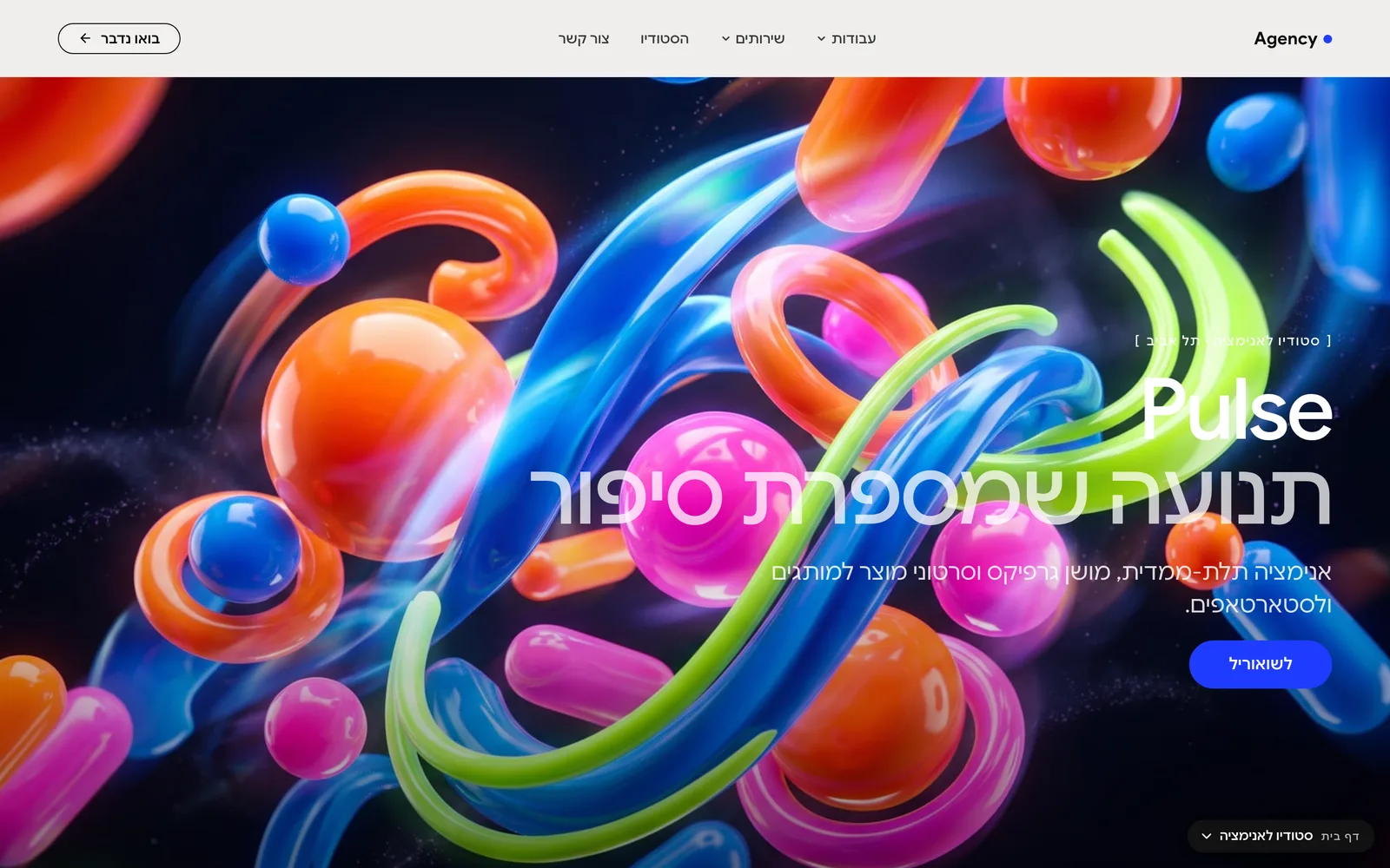
אותו sheet, בלי הפס מעליו: עולה מלמטה על כל המסך, ברקע גרדיאנט בצבע של הפרויקט (או שחור לסטודיו). כותרת ענקית ליד עיגול חזרה, פסקה גדולה, שורת עובדות, ואחר כך גלריה. מה שמשתנה הוא רק העיצוב. ושאלה פתוחה: הדרך פנימה צריכה להגיד שהיא פותחת משהו (ב-Cobalto לא שמים לב שזה לחיץ), ולקוח ממוצע אולי לא יבין שעלה לו פופאפ, כי זה נראה כמו דף חדש.
<FancyboxHtml id="case" sheet radius="0">…</FancyboxHtml>
/* full screen: no strip, its own back circle (data-fancybox-close), the item's colour */
#case { --uk-popup-sheet-gap: 0px; margin: 0; padding: 0; background: transparent; }
div.fancybox__slide:has(> #case) { padding: 0; }
#case .uk-popup-sheet__close { display: none; }
#case .uk-popup-sheet__scroll { background: radial-gradient(90% 70% at 30% 30%, var(--pc), var(--pc-deep)); }קישור בדסקטופ, פופאפ בטלפון
אין קומפוננטה, רק מה שיושב על הכפתור: ה-<Link> הוא הכפתור בכל מסך, ובטלפון נמתח מעליו טריגר של Fancybox עם md:hidden, אז הטאפ נוחת על הטריגר. בלי JS שמחליט מה המסך. הדף של הפריט נשאר (לגוגל ולדסקטופ). לינק פנימי בתוך הפופאפ סוגר אותו לפני הניווט: האטריביוט של Fancybox עצמו, data-fancybox-close, על הלינק או על UkButton (ה-init הגלובלי משאיר את הקליק ללינק), אחרת הפופאפ נשאר מעל הדף החדש. חי: הבית של הנגרייה (ProjectsQuickView), טאפ על פרויקט בטלפון.
<div className="relative">
  <Link href="/projects/x" className="uk-button">…</Link>        {/* desktop: goes to the page */}
  <a href="#x" data-fancybox="" className="absolute inset-0 z-[2] md:hidden" aria-label="…" />   {/* phone: opens the popup */}
</div>

<FancyboxHtml id="x">
  …
  <UkButton href="/projects/x" data-fancybox-close="">לעמוד המלא</UkButton>
</FancyboxHtml>

#fancybox-vanilla
Vanilla HTML popup
לאיזה תוכןאותו חלון קופץ, בלי React: כפתור ו-div בעמוד שכתוב ב-HTML פשוט
השאלהצריך חלון קופץ בקוד HTML פשוט, בלי רכיב?
תוכן חופשיכל שקופית היא JSX שלכם
המינימום המוחלט: כפתור ו-div. Lenis destroy/init נכנס אוטומטית דרך ה-[data-fancybox]. הגלילה בפופאפ נייטיב מלאה, ועם Fancybox.getInstance() מטופלים גם פופאפ-בתוך-פופאפ.
{/* Trigger */}
<a href="#hello" data-fancybox="">Open</a>

{/* Popup content — give it height so scroll-in-popup is visible */}
<div id="hello" style={{ display: 'none', minHeight: '200svh' }}>
  hello
</div>
מה צריך לזכור: (1) ל-trigger יש data-fancybox="" ו-href="#id". (2) ל-popup יש id="id" ו-display:none. (3) Lenis נהרס/נוצר מחדש אוטומטית בכל פתיחה/סגירה, תגלגל בפופאפ למטה (גלילה נייטיב), תסגור, ותראה שה-smooth scroll של הדף חזר.
#fancybox-netflix
NetflixSlideShow: Background
<Component />לאיזה תוכן3 עד 6 תמונות אווירה שמתחלפות לבד ברקע של hero, בלי חצים
השאלהה-hero צריך כמה תמונות אווירה, ואף אחת לא צריכה להיבחר?
⛓️👮♂️ מבנה קשיחimages: string[]השדות חובה בכל פריט, העיצוב גמיש
Auto-playing background slideshow: crossfade + slow ken-burns drift (the way Netflix swaps hero images). No arrows. Props: images, speed, and dots (Fancybox's own Dots plugin, pinned inside the frame at the bottom, off by default). It fills its parent (absolute), so wrap it in a position:relative box with a defined size.
// relative parent — NOT part of the component, just gives it a box
<div style={{ position: 'relative', height: 480 }}>
  <NetflixSlideShow images={[url1, url2, url3]} speed={6000} dots />
</div>




#fancybox-video
FancyboxVideo
<Component />לאיזה תוכןסרטון יוטיוב אחד ליד הסבר: תמונה עם כפתור הפעלה, והסרטון נפתח בחלון
השאלהיש סרטון שמסביר את הנושא, ולא רוצים שהעמוד יטען אותו מראש?
⛓️👮♂️ מבנה קשיחyoutubeId, titleהשדות חובה בכל פריט, העיצוב גמיש
import FancyboxVideo from @/components/fancybox/FancyboxVideo/FancyboxVideo

<FancyboxVideo youtubeId="fvWIRizTqog" title="Elementor Pro in 3 minutes" caption="הסרטון הרשמי של Elementor" />